
Charge easy
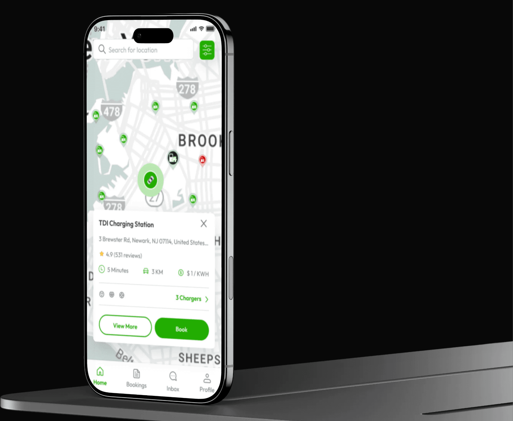
Chargeeasy is a U.S. EV charging marketplace where drivers can find and reserve chargers, while hosts can list theirs, set availability, and earn from unused capacity.
// About us //
Chargeasy is an electric vehicle (EV) charging platform that connects drivers with nearby charging stations, allowing them to locate stations, sign up, and book charging sessions through a mobile app.
When I joined the project, the app was already live — most users who downloaded it never completed signup or booked their first charge. While there was clear interest in the product, user engagement dropped sharply at the early stages of the experience.
- Status
- Live
- Platform
- Mobile Application
- Role
- Product Designer
- Country
- U.S.A
The brief
It started with a request to “make it modern”
The brief that landed on my desk was simple:
“We want to modernize the app.”
And they weren’t wrong. The interface did look dated, like it had been built quickly, visual consistency was poor, and several interactions felt clunky. Instead, I paused. I’ve learned that redesign requests often hide a deeper business problem. A better-looking interface doesn’t automatically create better outcomes. Before changing anything, I wanted to understand why the redesign was needed in the first place.
This led to the bigger question
Was making the app look better really all Chargeeasy needed, or were there user complaints, and bigger issues sitting underneath the redesign request?
The problem
The brief said “redesign.” The funnel said otherwise.
Discussing with a stakeholder led to a big discovery: Chargeeasy was getting downloads, but people were not staying. The app has over 500 downloads. But the numbers underneath told a different story: fewer than 50 people ever completed sign-up, and fewer than 20 ever completed a booking.
Downloads
500+
Sign-ups
50
90% never created an account
Bookings
20
60% of the few who signed up still didn’t book
What this told me
People were interested enough to download Chargeeasy. The bigger issue appeared to be what happened after that. Most users were leaving before creating an account, and only a small number were making a booking.
Discovery
Understanding the problem before I tried to solve it
The easy move would’ve been to open Figma and start restyling screens. That would’ve cost me nothing up front, but it would not have been best for the business.
At this stage, I didn’t know why users were leaving. I only knew where they were leaving. There are countless reasons someone might abandon a product before signing up.
- Maybe registration asked for too much too soon.
- Maybe users couldn’t tell if there were chargers near them.
- Maybe they weren’t sure whether a charger would work with their vehicle.
- Maybe they simply hadn’t seen enough value yet.
Those were guesses, not insights. I needed evidence before I could justify a single design decision.
Research method
Research with the resources I had
There was no budget for interviews with the exact users who mattered most — the ones who downloaded and quietly disappeared. That data didn’t exist yet, and there wasn’t time or headcount to go build a formal research study from scratch.
So instead of waiting for research I couldn’t get, I built a lightweight case out of the evidence that was already sitting there:
Product audit
Using Chargeasy myself, screen by screen, like someone who’d never seen it.
Competitive review
Studying top EV charging apps, to understand what drivers already expected from this category.
Product/UX heuristic evaluation
A pass against basic usability and trust principles.
App Store and Play Store
Reviews — hundreds of real complaints, unprompted and unfiltered.
Product audit
I used Chargeeasy like someone who had never seen it before.
I spent a few hours moving through the app the way a first-time driver would — not looking for visual inconsistencies, but paying attention to every moment I hesitated. Five of those moments stood out:
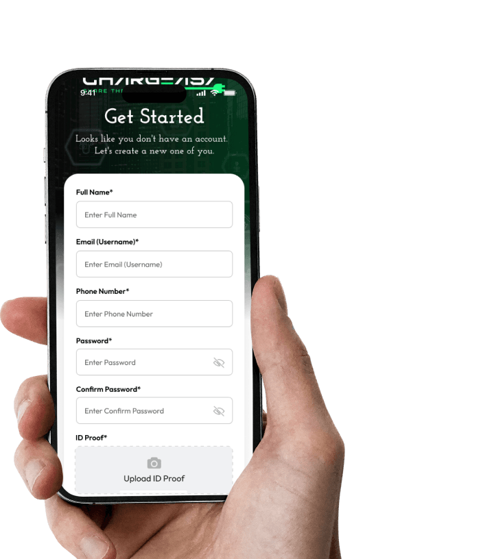
The product asked for trust before earning it.
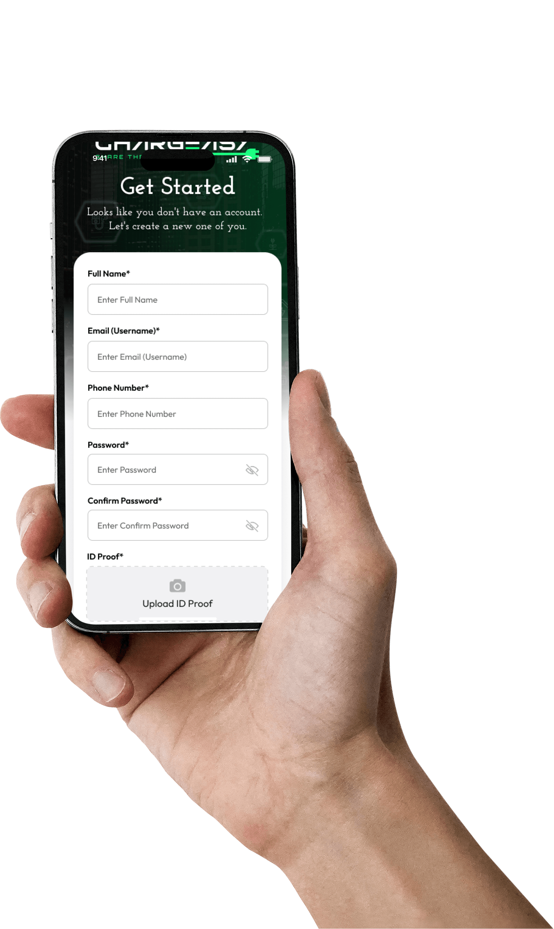
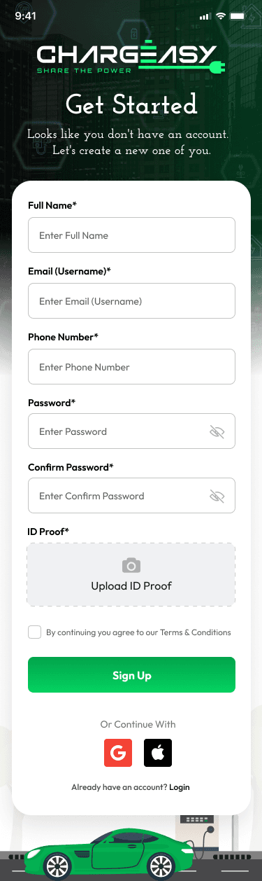
Imagine walking into a mall to buy something, only to be stopped at the entrance and asked to fill out a form before you could even look around. That was the onboarding experience. Before people could see nearby chargers, check whether one worked with their car, compare prices, or know whether there was even a charger close to them, they had to create an account.
A map pin is not a decision.
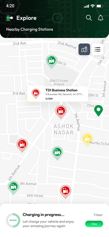
The map showed where chargers were located. But that was about it. It felt like trying to pick a restaurant from a map where you could see the locations, but not the menu, prices, opening hours. To know whether a charger was compatible with my vehicle, how fast it was, whether it was available, or how much it cost, I had to open each station individually. Open. Close. Open another. Compare. Go back. Repeat.
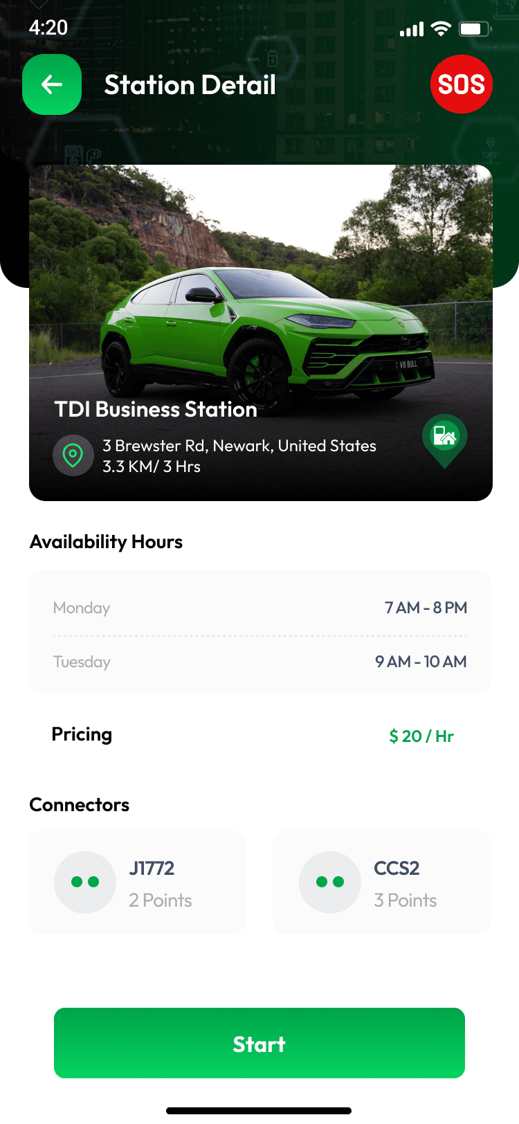
The station details didn’t answer key questions.
Before committing to a charger, a driver needs to know it’ll work with their car, that it’s actually online right now, and roughly what it’ll cost. The existing page buried this information under things that didn’t matter nearly as much. People weren’t browsing for fun — they were looking for confidence.
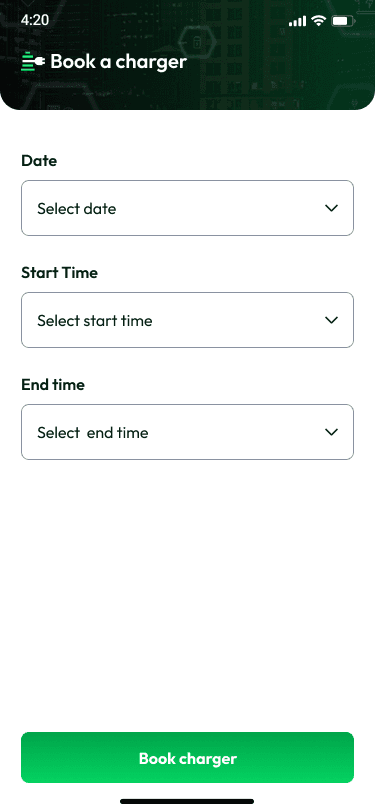
The booking flow reduced very little uncertainty.
The booking flow did very little to reduce uncertainty. Drivers could not see the exact time they were able to book, so it didn’t really solve the key problem, which was reserving a charger.
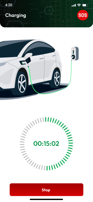
Once you were charging, you were on your own.
Mid-session, the app gave almost no visibility into progress, time remaining, or what to do if something interrupted the charge. Drivers couldn’t see their own progress clearly, and had no obvious way to get help if something stopped working. In a physical, sometimes remote setting, that silence is exactly when people need the product most.

App Store Reviews
I wanted to know if users saw the product the same way I did.
I wanted to know if real users experienced the same friction I did, or if I was projecting my own assumptions onto the product. The reviews confirmed it — and organised themselves into three recurring questions:
Does the information match reality?
Users repeatedly arrived at chargers marked available, only to find them occupied, broken, or incompatible. The map was making a promise the real world wasn’t keeping.
Can I decide before I drive?
Drivers wanted to know the answer before committing to a trip — is this charger compatible, is it actually working, what will it cost — not after they’d already made the drive.
What happens when it breaks?
The experience became weakest when things went wrong. Failed sessions, unavailable chargers, payment issues, and unclear support created frustration at the exact moment users needed reassurance. The happy path wasn’t enough — recovery had to be part of the core experience.
Reading the reviews wasn’t just validating, it reframed the ask. Users weren’t asking for more features. They were asking for more certainty. That sentence became the actual brief. Not “modernize the app.” Reduce uncertainty at every point a driver has to trust the product with their time, their car, or their money.
Looking beyond Chargeeasy
I also spent time looking at products people already trusted.
I also looked at products people already trust in adjacent categories — not to copy their screens, but to understand what drivers already expect a well-built version of this experience to feel like: clear real-time availability, upfront pricing, and a visible plan for when something goes wrong.
Synthesis
Connecting the dots.
At this point I had evidence coming from different directions — a product audit, competitor research, and hundreds of reviews — and individually, each one was useful. Together, they told one story. I brought everything into one board and they traced back to one of three questions a driver could never confidently answer:
Question 1
Can I use this charger?
(compatibility, availability, connector type)
Question 2
Can I trust this information?
(accuracy of status, pricing, and hours)
Question 3
Can I rely on this booking?
(what happens between reserving and actually charging)
Design principles
Four principles guided the redesign:
Before designing anything, I wanted a clear set of principles. Not rules. Just reminders of what we were trying to achieve. Those four principles became a simple filter for every design decision that followed. Whenever I found myself debating an interaction or layout, I came back to one question. Does this reduce uncertainty for the user?
Show value before asking for commitment
Users shouldn’t have to create an account just to find out whether Chargeeasy is useful. The product should prove its value first.
Put the important answers first
Compatibility, availability, and price above everything else — every other detail is secondary.
User journey
The new flow let drivers look around first.
Commitment first
Open app
Create account
Verify details
Explore chargers
Book
Value first
Open app
Explore nearby
Compare options
View details
Choose a charger
Sign up to book
Confirm
Designing the experience
By the time I opened Figma, I wasn’t thinking about making the app look better. I was thinking about confidence.
By the time I opened Figma, I wasn’t thinking about making the app look better. I was thinking about confidence — every screen had one job: help a driver answer their next question as fast as possible. If someone had to stop and think “can I trust this?”, the design wasn’t doing its job yet.
Let drivers explore before signing up
01The biggest decision I made was removing forced sign-up. Previously, the first thing users saw after opening the app was a registration screen, before they knew whether Chargeeasy was even useful to them.
The new experience started with the map. Users could immediately explore nearby chargers, search another location, compare options, check compatibility and view station details. No account required.
Sign-up only appeared when users wanted to reserve a charger, save a station, complete a payment or manage a booking.
It was a small change in the journey, but a big change in motivation. By the time users reached registration, they already understood the value of the product.
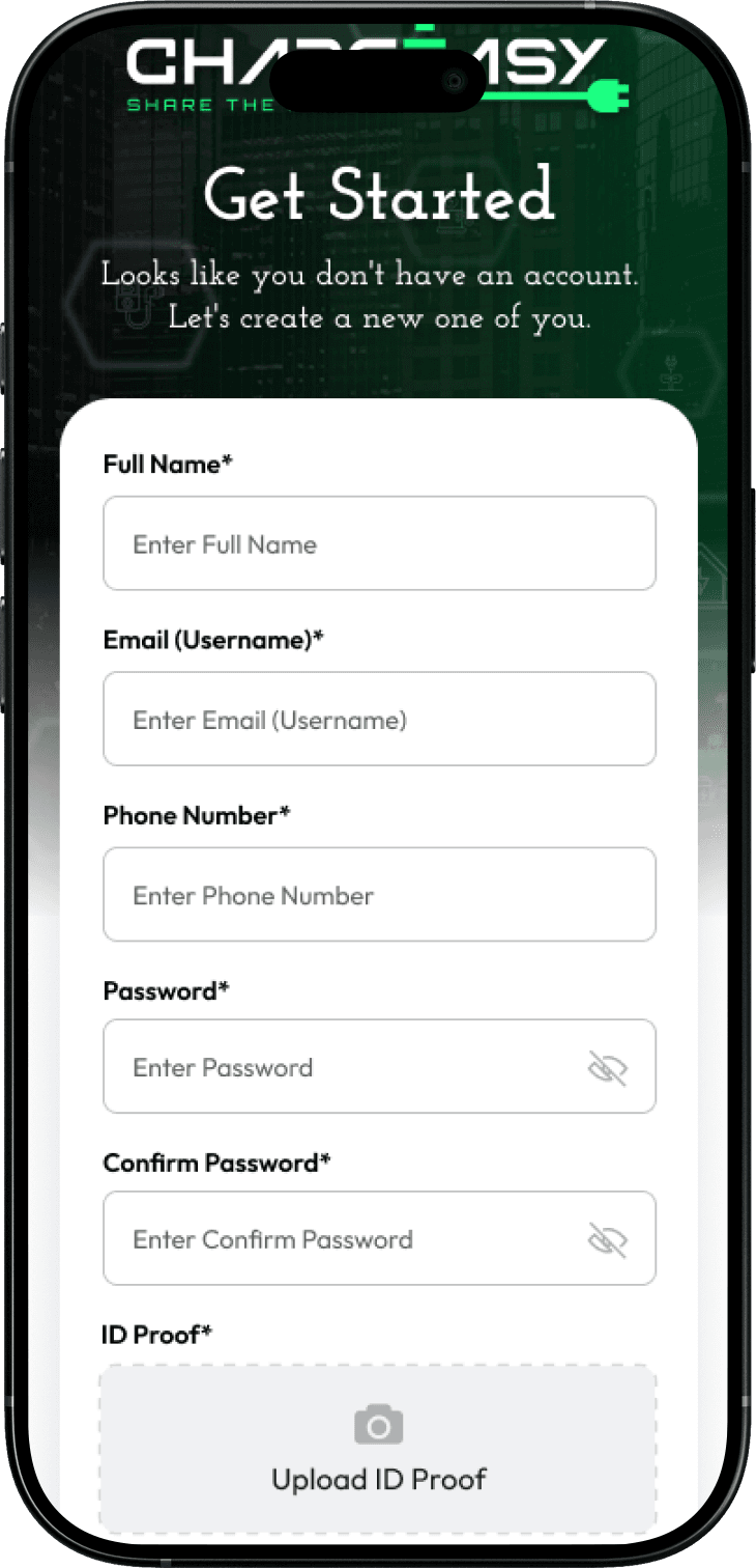 Before
Registration came before discovery. Users had to provide personal information before they could see whether Chargeeasy was useful to them.
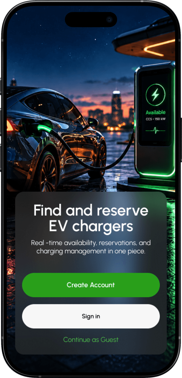 After
AfterUsers can look around and find a charger before signing up.
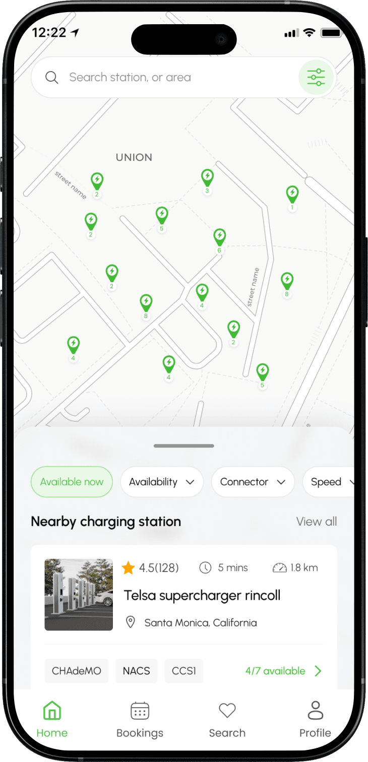 After
AfterI let users see nearby chargers first, so they can understand the value of the app before creating an account.
Tradeoff
This didn’t remove identity verification — it moved it. Drivers still verify identity before anything payment- or account-dependent. The ask just happens once they’ve already found a reason to want in, instead of before they’ve seen anything at all.
I redesigned the map to help people compare, not just browse.
02The redesigned map surfaces the information drivers need before they open a station page — availability, charger type, connector type, charging speed, distance, and basic pricing — plus filters for the things people actually use to narrow down a choice. The goal wasn’t to pile every possible detail onto the map. It was to make it fast to rule out chargers that don’t work for you, so the only stations left are ones worth a second look.
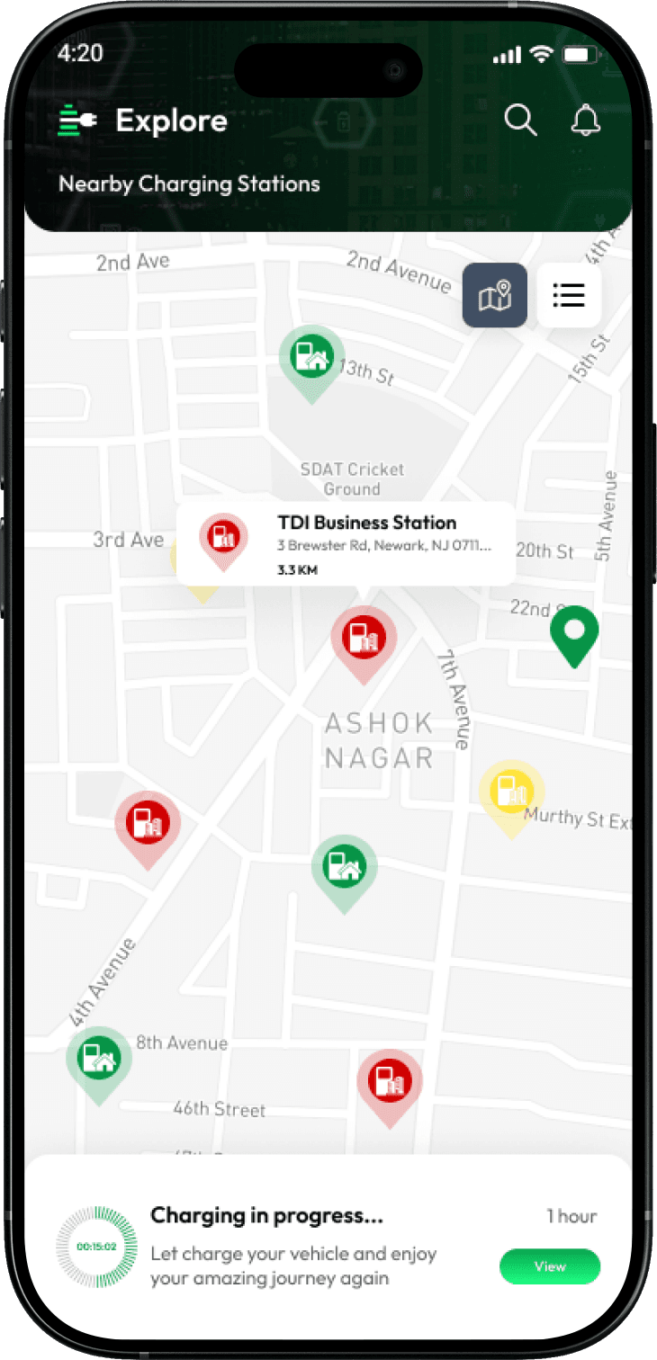 Before
The map showed charger locations, but gave users little information to compare their options.
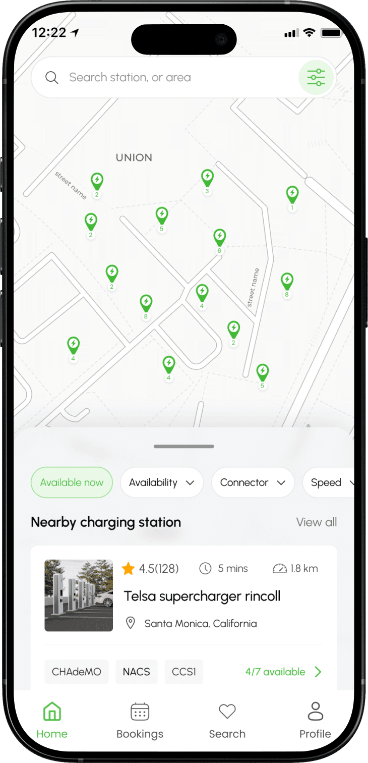 After
AfterI added charger details to the map so users can compare options without opening every station.
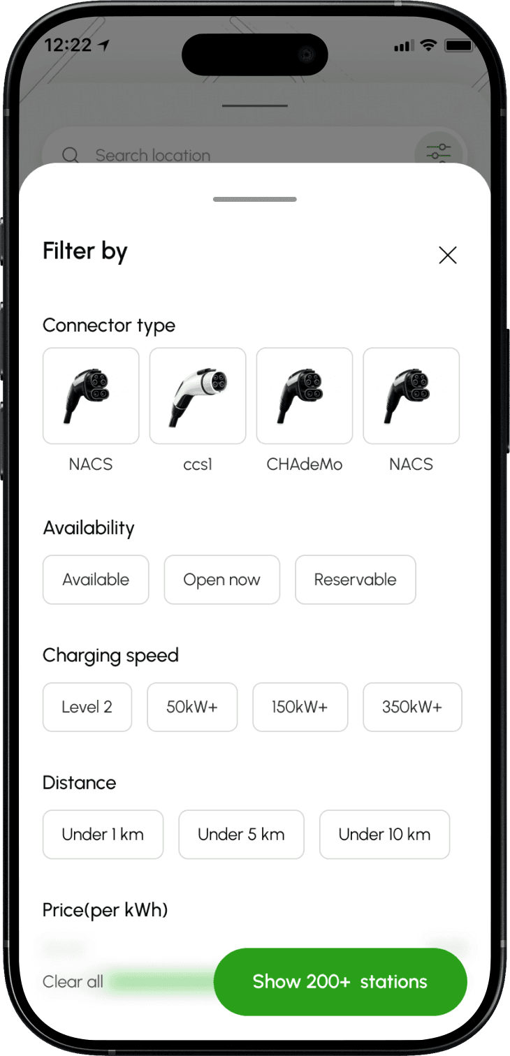 After
AfterUsers can narrow down chargers based on the things that matter most to their trip.
Tradeoff
More information on the map risks clutter. I limited surfaced data to the five factors drivers actually filter by, and pushed everything else to the detail page.
Turn station details into a confidence-building screen
03This is where a driver decides whether they’re comfortable committing to a booking. Instead of simply listing information, I redesigned the page around the questions drivers actually ask, in the order they ask them: real-time availability, charger and connector type, charging speed, vehicle compatibility, pricing, distance, photos, hours, parking and access instructions, amenities, reservation availability, cancellation policy, and support information.
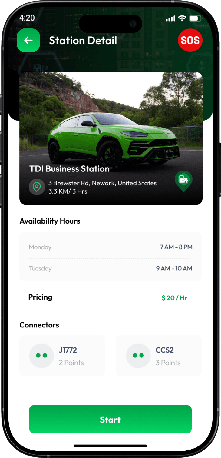 Before
Drivers had to work through station information to determine whether a charger was suitable.
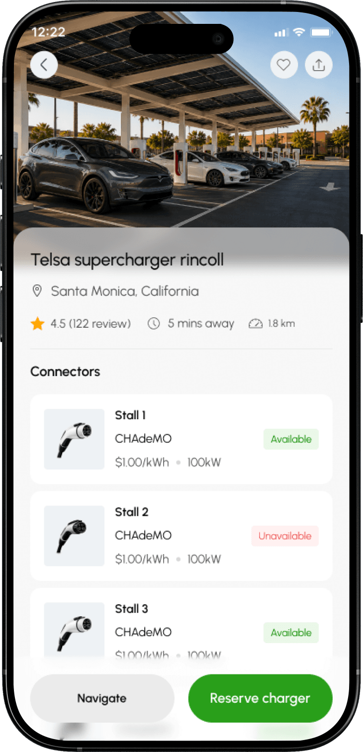 After
AfterUsers can check the charger type, speed, availability and other details before making a booking.
A detail I pushed for
Parking instructions and entrance photos weren’t treated as optional extras. In a physical, real-world product, they’re the difference between a successful session and a driver giving up outside a locked gate.
Make the booking feel like a real commitment
04Booking is where interest becomes commitment. The redesigned flow makes every detail visible before payment — charger, date, time, duration, price, cancellation rules, access instructions, and support — and after booking, drivers get more than a generic success message: a clear confirmation of exactly what they reserved and what to expect on arrival.
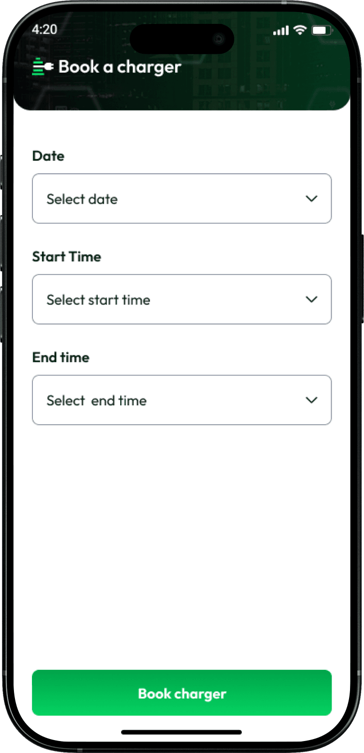 Before
The booking flow provided limited context around what the driver was committing to.
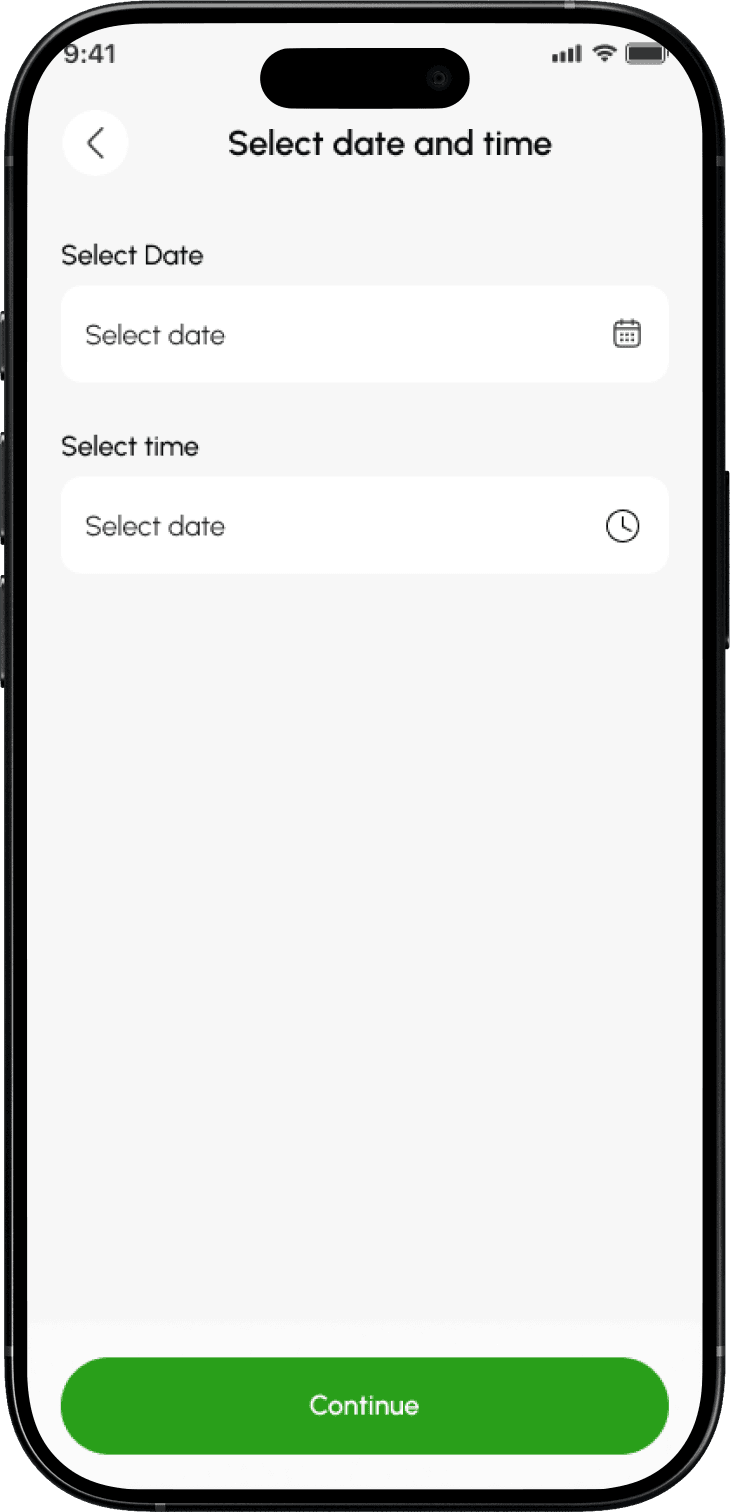 After
AfterUsers can choose their charger and preferred time before moving on to confirm the booking.
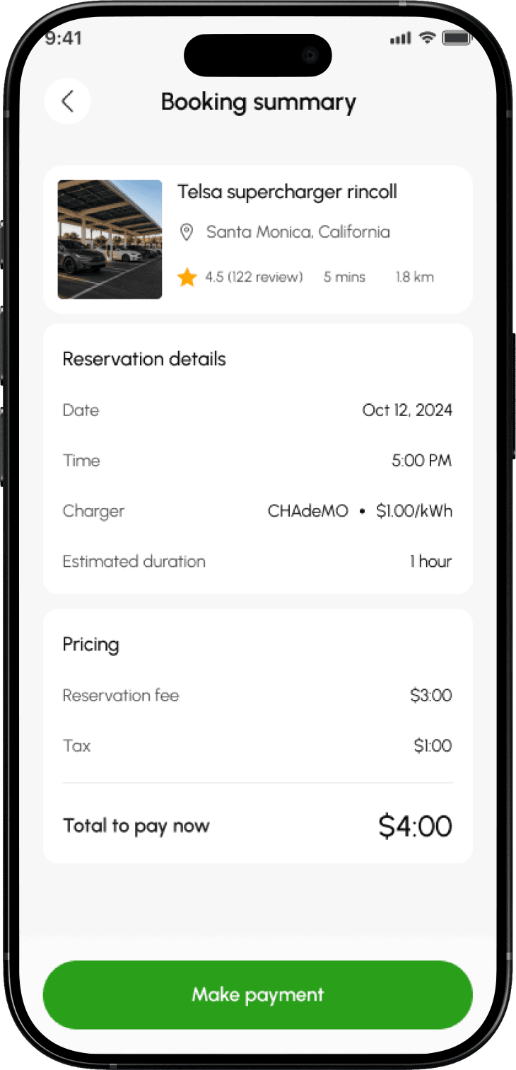 After
AfterThe reservation details are made explicit before the driver commits.
Solution and tradeoff
The goal wasn’t just to increase bookings. It was to reduce the anxiety that often comes with making one.
Connect reservation, arrival and charging into one journey
05Booking wasn’t the end. The real value was arriving, starting a session, and leaving with enough charge. The original product compressed an active charging session into a small status element — exactly the moment a driver most needs reassurance and a clear way out if something fails.
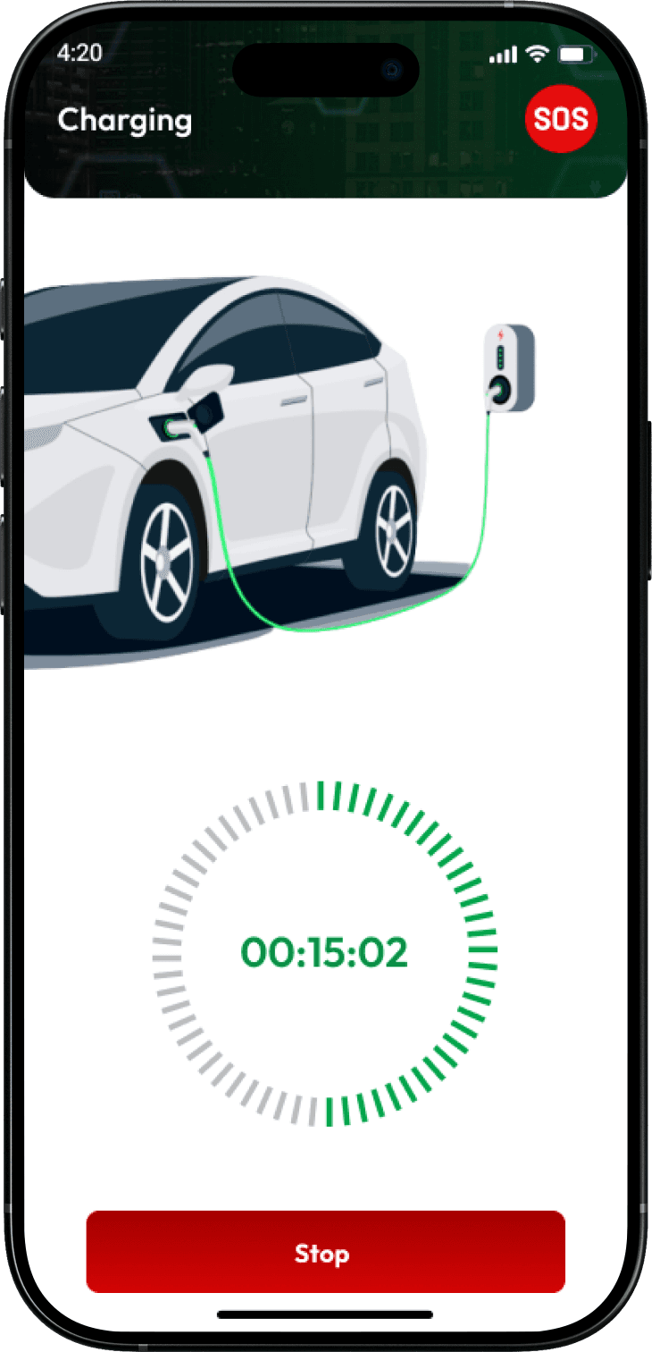 Before
The previous flow provided limited information after booking.
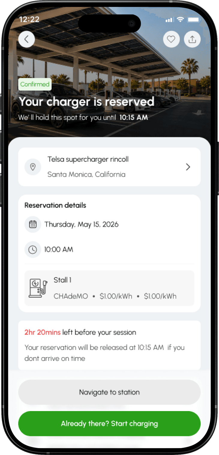 After
AfterThe reservation now carries into the arrival experience, giving drivers clear next steps at the station.
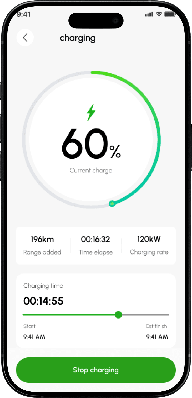 After
AfterOnce charging starts, drivers can see the session status and key charging information at a glance.
Solution and tradeoff
Treat the live session as the product, not a footnote. The charging experience now gives clear feedback before, during and after a session: progress, cost, range added, and completion — so the driver always knows what’s happening and how to act.
Some of this depends on telemetry the platform doesn’t fully control. So the interface is built to stay honest when data is uncertain: it shows last-known status with a timestamp rather than a confident number, and the SOS and fault paths exist precisely because the design can’t promise the hardware will always behave.
What I’d do differently
Two things I’d push for earlier
Get one round of primary research before designing
Review-mining is good for finding where to look, weak for explaining why. I’d trade three audit days for five driver interviews to test whether “confidence,” not discovery, was really the blocker — instead of inferring it.
Pin the booking policy with the team in week one
The booking guarantee was the highest-leverage move and the most cross-functional. I settled hold rules and no-show handling mid-project; doing it first would have let me design the confirmation around a known policy rather than around it.
Final reflection
This started as a request to modernise an interface. The larger opportunity was helping drivers make a high-consequence decision — drive here, charge, get home — with less uncertainty.
My contribution was to reframe the brief from visual refresh to booking confidence, isolate the three moments where that confidence broke, prioritise against marketplace impact and feasibility, and work with the team to turn those insights into a more credible booking experience. It didn’t solve ChargeEasy’s marketplace challenges outright. It gave drivers a clearer, more dependable path from discovery to a charge they could trust.
Explore more projects
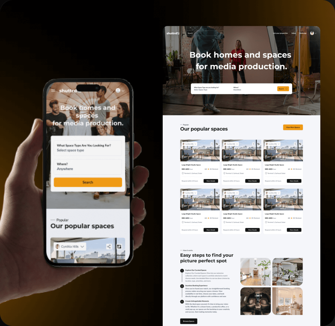
Shuttrd — Creative Space Rental Web & mobile app
Designed the web and mobile applications and continue to lead ongoing feature improvements and user experience.
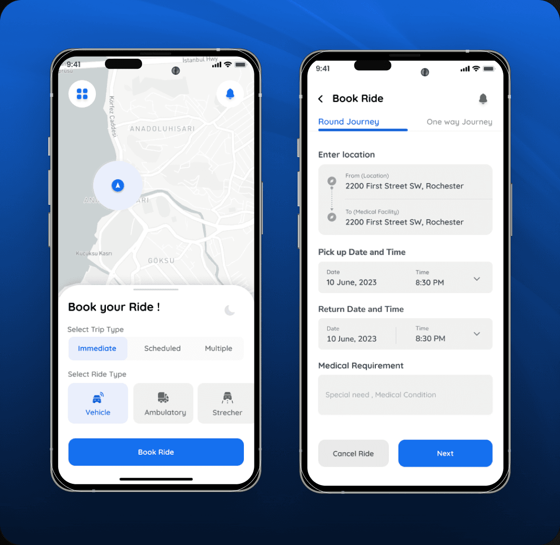
Rove Now — Non-Emergency Medical Transportation
Redesigned how Rove managed medical transportation, from the first ride request to the moment a patient got home.
Available to work
Let’s build something meaningful together
Whether you have a project in mind, want to collaborate, or just want to say hello, I’d love to hear from you.